← All UI/UX workCASE / 01 · INDEPENDENT PROJECT · 2026

FROM PERSONAL FRICTION TO A WORKING PROTOTYPE

Planner
Prototype Study

Making room for ideas.
Making the controls feel familiar.

Working app ↗ (opens in a new tab)
The working browser planner with editable notes, connectors and a grouping container
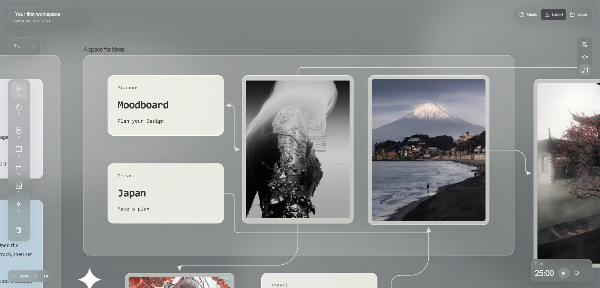
My reference workspace brings Moodboard and Japan notes into a close view alongside images and soft connectors. This composition informs the prototype’s starting view.
MY ROLE

Interaction design, visual direction and iterative evaluation

BUILD

HTML, CSS and JavaScript
AI-assisted implementation

EVIDENCE

Personal use and version history
Peer usability test planned

01 / THE STARTING POINT

A place to think
with images and notes.

I wanted a workspace where I could collect references, write thoughts and arrange them visually. While using my own prototype, I kept noticing small moments that interrupted that flow. Some text could not be edited, boxes were awkward to resize and settings covered the board.

Those interruptions shaped my design question. how can a visual planner offer freedom without making its basic controls feel unpredictable?

The intended audience is people organizing early ideas and visual references. This is a design hypothesis drawn from my own workflow, not a finding from audience research.

02 / HOW I WORKED

Use it.
Notice friction.
Try a change.

I directed the interface and interaction behavior, used AI to help implement changes and evaluated successive versions. My feedback became increasingly specific. I defined which edges should resize, how selections should respond to clicks and how connectors should behave near cards.

  1. Identify a concrete interruption.For example, copying an image after a note caused the old note to paste again.
  2. Describe the expected behavior.The current clipboard content should determine what appears on the canvas.
  3. Revise and check the interaction.The implementation was changed to distinguish image data from copied components.
  4. Keep the iteration visible.I retained numbered versions so earlier decisions and corrections could inform the next pass.

03 / SELECTED DESIGN DECISIONS

Small behaviors.
Meaningful differences.

01

Make resizing feel familiar.

Corner-only resizing and visible square handles did not match the interaction I wanted. I requested resizing from every edge and corner, with the cursor showing what would happen before a drag.

ITERATION

Invisible edge targets, directional cursors and an optional Alt-drag shortcut. Notes expand to show their text instead of creating a second scrolling area.

TRADEOFF TO TEST

Less visual clutter can also make resizing harder to discover. The next test should reveal whether the cursor feedback is enough.
INTERACTION / RESIZE
01 / START HEREA little room
for an idea.

Drag an edge to reshape the note. Keep the thought together and the text in view.

Resize from any edge or corner
Interaction illustration · The cursor signals the active edge. The note changes shape while its text stays visible.
02

Keep connections readable.

I wanted arrows to organize a board without cutting through its content. I also clarified that “soft” meant a more relaxed path, rather than a lighter arrow color.

ITERATION

Obstacle-aware routing, a connector preview that follows the pointer, target snapping and a two-way option. Arrow colors respond to the workspace theme.

TRADEOFF TO TEST

Automatic paths can take a longer route. Dense boards still need checking for crossings and ambiguous relationships.

INTERACTION / CONNECT
PLACE CARDJapanANOTHERNOTEREFERENCEImageChoose the source card
Interaction illustration · Preview, snap and route. The completed path uses the prototype’s routing code to avoid the middle note.
03

Let appearance support the work.

The glass treatment initially had strong white accents and a green tint. Darker themes exposed text and icon contrast problems. Floating settings also interrupted access to the board.

ITERATION

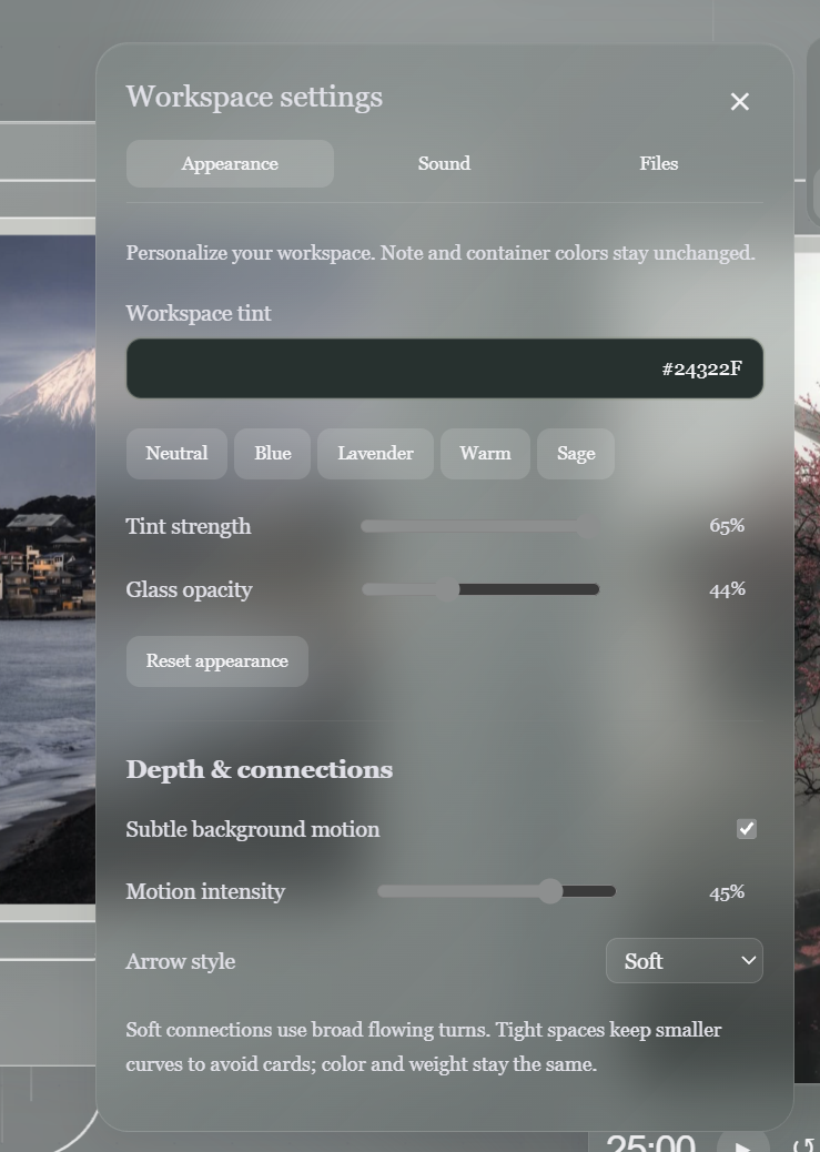
Adjustable tint and opacity, theme-responsive controls and a shared location for workspace settings, note controls and the music library. Clicking outside dismisses the panels.

TRADEOFF TO TEST

Transparency and motion are aesthetic choices, not proven usability improvements. Readability across themes and motion preferences still needs evaluation.

INTERACTION / ADAPTIVE APPEARANCE
WORKSPACE SETTINGS

A softer workspace.

Text, controls and borders respond to the surface.

Tint strength0%
Glass opacity44%
↖✥⚙
IDEAREFERENCE
Live theme example · Uses the working app’s color calculations. Opacity changes the glass surface. Arrow contrast adjusts with the canvas tint. Note colors remain unchanged.
INTERACTION / ADAPTIVE CARD TEXT
01 / YOUR NEXT IDEA

Make it your own.

Choose a card tint. With automatic contrast on, the label, title and note switch between light and dark text.

✓ Automatic contrast
Card tint#F5F5ED
Text color#30382E
Live contrast example · Uses the working app’s card-text calculation. Text contrast adjusts automatically until a custom text color is chosen.
Close view of the visual planner showing connected Moodboard and Japan cards
Canvas composition · Content stays in the foreground with the glass container behind it.
Workspace appearance controls showing tint 24322F, strength 65 percent, glass opacity 44 percent, motion 45 percent and soft arrows
Appearance controls · My chosen starting tint, transparency, motion and connector style.

MORE CANVAS INTERACTIONS

Keep related ideas together.

INTERACTION / MOVE A GROUP
OUTSIDE GROUPStays hereTRIP IDEASJapanPlaces to goMove the container · enclosed items keep their arrangement
Interaction illustration · Notes and an image travel with their container. The separate card stays in place.
INTERACTION / TEXT EXPANSION
01 / A THOUGHT IN PROGRESS

Keep the whole idea.

The note grows as the thought gets longer.

Interaction illustration · New lines expand the note vertically. The complete thought stays visible without an internal scrollbar.

04 / VALIDATION PLAN

Can someone else
find their own way?

PLANNED · RESULTS NOT YET COLLECTED

I prepared an unassisted session with a friend. The task is to plan a solo Japan trip. My friend will start music, choose three places and make a note for each. They will gather two Pinterest images per place and connect them to the matching cards. Then connect the places in visit order and export the board.

With permission to record, I will ask them to think aloud and avoid coaching. I will note whether they can complete each step, where they hesitate, when they ask for help and whether an issue comes from the planner or Pinterest.

One session can reveal specific problems. More sessions would be needed to understand how well the design works for different people. I have not yet collected completion times, success rates or participant feedback.

CURRENT OUTCOME

A working foundation.
A clearer next question.

The result is an interactive browser prototype with editable notes, images, containers, connectors, session editing and board export. Its strongest evidence today is the sequence of concrete interaction changes—not a measured improvement in productivity.

My next question is whether a first-time user can build a connected visual plan without explanation. That test will guide what I change next.

Desktop recommended. This demo resets when reopened or refreshed. Export your board to keep your changes. Music uses a third-party service and requires an internet connection.